
Web design for businesses
Mirror Esthetics
Skin care, people, and an introduction that starts on the site
Discovery, design, and development of a website for a skin care studio in Winston-Salem, North Carolina. An elegant visual language, team photos, and detailed treatment pages take visitors from exploring their options to getting in touch.
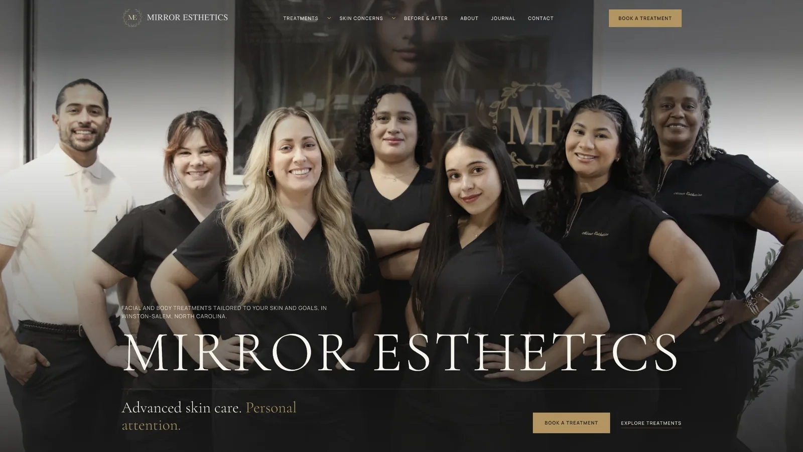
Mirror Esthetics
The need
The site lets visitors get to know Mirror through a specific treatment or a skin concern, and weaves in information about the team and the space as part of a calm, clear experience.
- 01
Start with the visitor's question
Connect a professional treatment menu to the concerns people can describe in their own words, such as dryness, texture, or uneven skin tone.
- 02
Bring clarity before they reach out
Explain who each treatment is right for, how the visit goes, and what's good to know ahead of time, so every treatment page answers practical questions and leads naturally to a conversation.
- 03
Meet the people behind the treatment
Give the team, the personal approach, and the space itself a real presence. The photography and the story of the place need to run through the whole site, not only the About page.
- 04
Elegance that stays readable
Combine delicate headings, large images, and a lot of content in a clear hierarchy that holds up consistently from wide screens to mobile.
From the site
What was built
 Enlarge image +
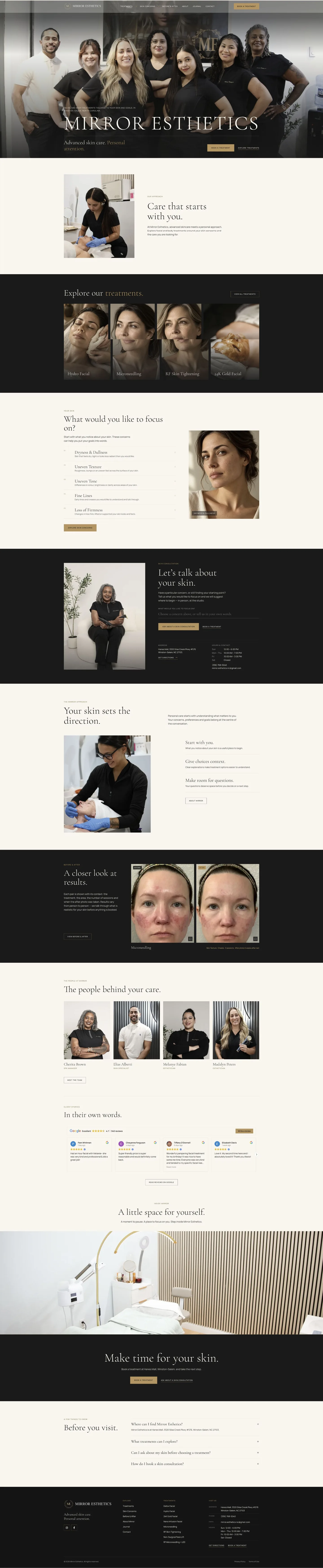
Home pageAn introduction to the treatments and the people behind them 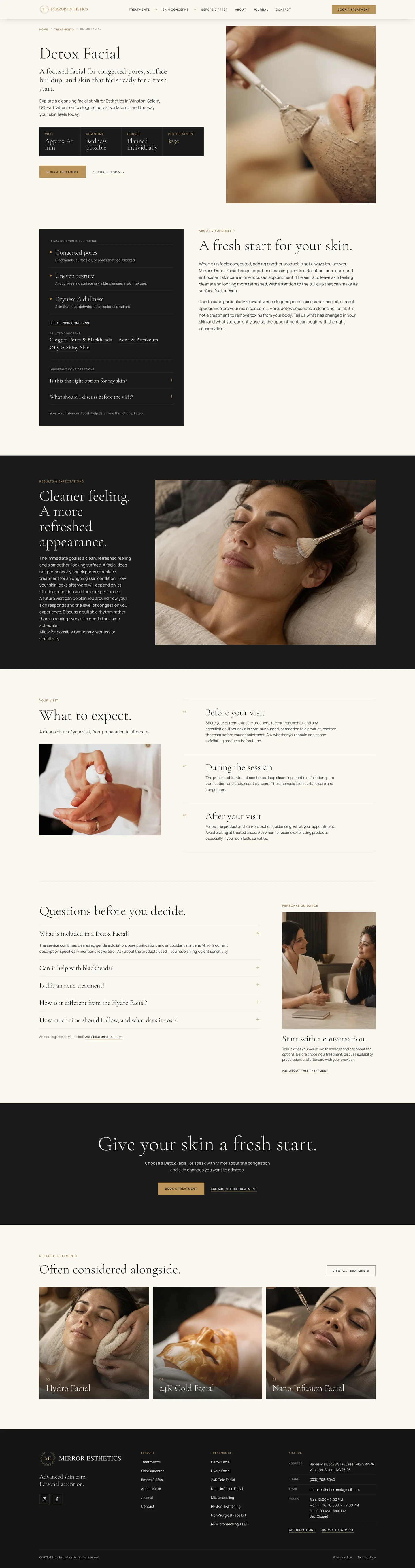 Enlarge image +
Treatment pagePractical details, from weighing options to getting in touch 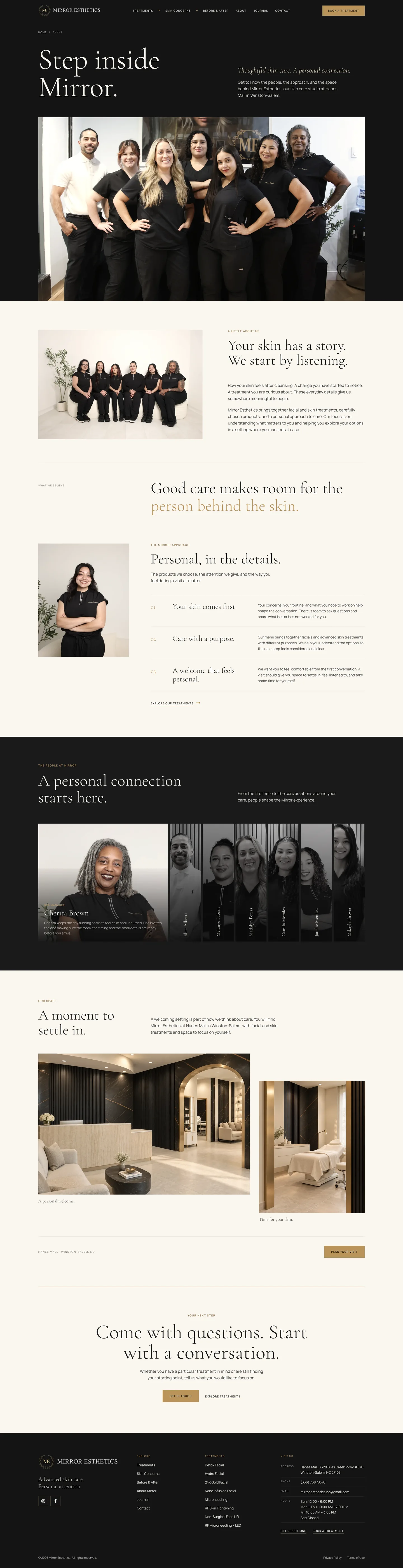 Enlarge image +
About pageThe personal approach, the team, and the space
- 1
Planning around two entry paths
A structure that lets a visitor start from a specific treatment or from the question on their mind. The navigation connects treatments, skin concerns, team information, and contact.
- 2
Calm visual language
Cream tones, black, and a refined gold, with elegant typography and wide-format photography. Alternating light and dark sections give each part its own space while keeping a shared identity.
- 3
Treatment page template
An opening screen with practical details, followed by who the treatment is right for, how to prepare, the steps of the visit, FAQs, and related treatments. One fixed structure presents different treatments consistently.
- 4
About page with the people and the space
A page that presents Mirror's approach through team photography, personal introductions, and photos of the space. Interactive team cards let visitors focus on one person at a time.
- 5
Content that adds context
Before-and-after sections, testimonials, and FAQs sit alongside explanations and links to next steps. It all helps visitors get to know the studio before they get in touch.
- 6
Development for every screen
I built the site on WordPress with reusable content templates, responsive components, and calls to action throughout. A way to get in touch stays within reach, even after a long read.
From first visit to inquiry
The visitor's path
through the site
The site lets a visitor move from a first impression to a closer look, without having to choose a treatment right away.
- 1
Find a starting point
Visitors enter through a familiar treatment or a skin concern, and reach the relevant content from the navigation or the home page.
- 2
Understand the options
The treatment page covers who the treatment is right for, details about the visit, and FAQs, in a structure that's also easy to read one section at a time.
- 3
Meet the people
Team photography, the About page, and photos of the space connect the professional information with the place where the treatment happens.
- 4
Move on to a conversation
Links to get in touch and to book a treatment appear throughout the content, so visitors can ask whether a treatment is right for them and what comes next.
Intro call
Planning a website for your business?
Tell me what your business does and what the website needs to let your customers do. We'll figure out together what's right to build.
A small studio. On purpose.