In short
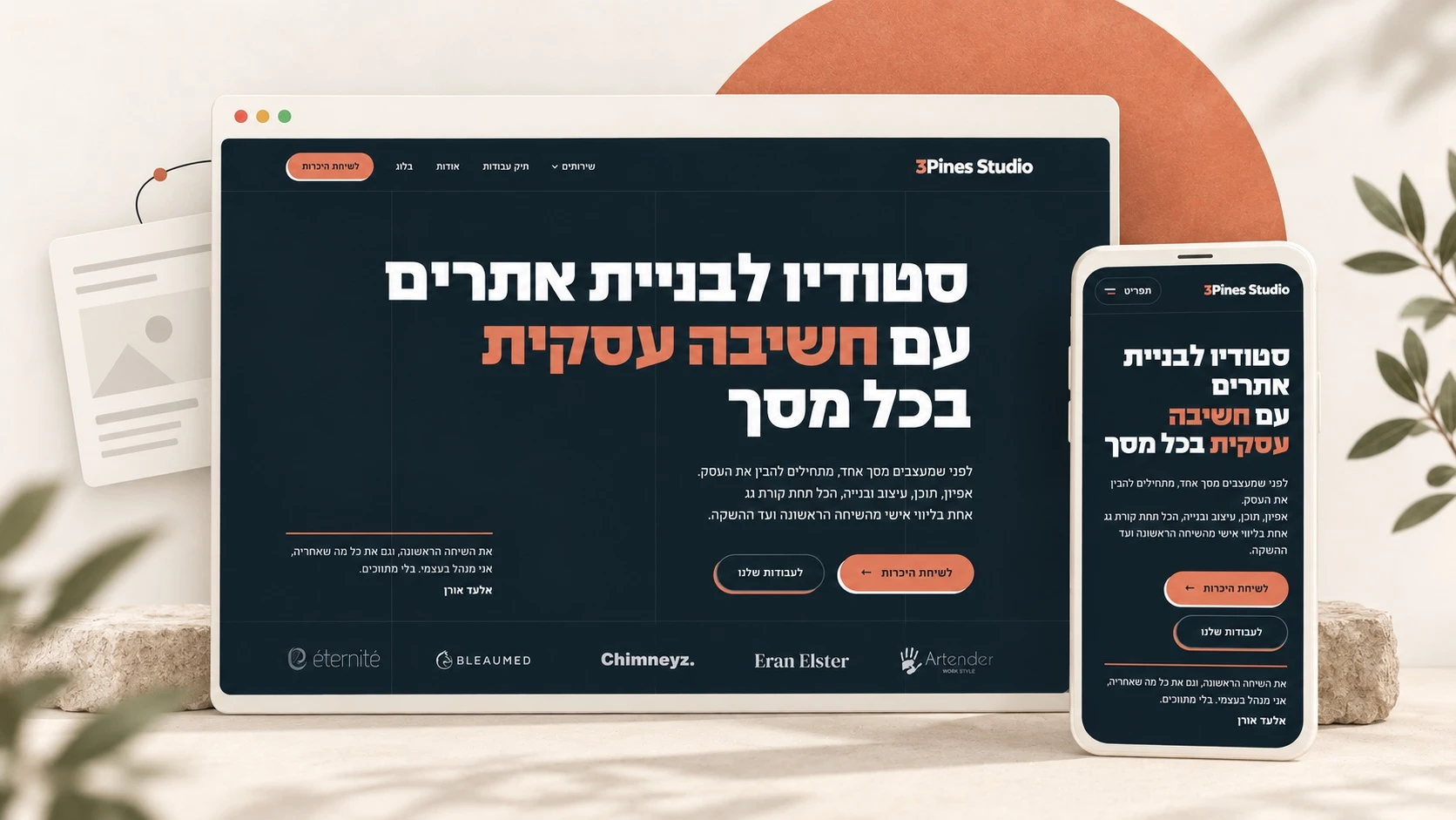
I rebuilt the studio's website because it no longer fit the work I do today, and it had become clunky to keep developing. I worked with Claude Design and Codex on the design, the content, and the build, with many rounds of testing and fixing. I kept the important content and the page URLs, cleaned up the system, and fine-tuned how the site works on desktop and on mobile. Now the studio has a site that's easier to update, with room for the next projects and articles.
The new 3Pines Studio website is live, and I’m excited to share both the result and how I got there.
This time I had to look at my own business the way I look at a client’s before I build them a new site. I had to ask what the site needs to say, what’s outdated or no longer fits, and how I want visitors to get to know the studio and understand what I actually do.
It was a chance to get things in order, refresh the design, and apply to my own site what I’ve learned working on other people’s. Along the way I worked with Claude Design and Codex: I tested, gave feedback, and changed plenty of details until everything came together.
So here’s the story of the new site, from the decision to rebuild it to the moment it went live.
Something about the old site wasn’t working for me anymore
I built the previous site when the studio was just getting started. It carried me through my first projects while I was learning and getting better. But when I looked at it again with the experience I have now, I saw quite a few things I’d build differently.
Some parts of it weren’t built right from the start. Over time I added more content, more images, and more changes, and the site got a little clunky. It became harder to keep it organized and to keep developing it the way I wanted.
The design needed a refresh too. When you visit the website of a web design studio, you want to see the work, understand what the studio offers, and get to know the person behind it. I wanted my site to show all of that as it is today.
That site did its job and helped me get started. Now I wanted to take what I’d learned and rebuild it in a way that fits me better.
What I wanted to be different
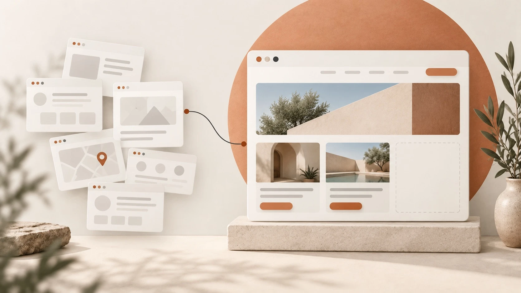
I wanted a site that’s easy for me to work with, where I can add a project, publish an article, or update a service without every small change turning into a big production. I also wanted it well organized from day one, so I can expand it as the business grows.
Before any code or design, I went through the content. How do you explain what the studio does to someone who doesn’t know the field? What’s worth saying about each project? And how do you help a visitor figure out whether I’m the right person to build their website?
I decided to stay with WordPress, but this time to build a custom-coded theme with custom editing fields, using ACF. In plain terms: every piece of content has a clear place in the dashboard, and I can update it without rearranging the design every time.
On this project I also chose to drop Elementor and let go of plugins the new site didn’t need. I wanted a lean, mean fighting machine: a system that’s simpler to maintain, light and fast, where I know what every part does and why it’s there.
How I worked with Claude Design and Codex
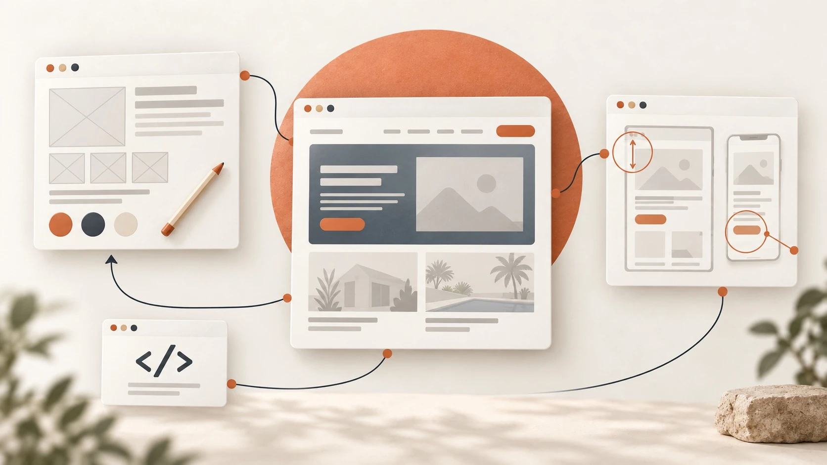
I built the design with Claude Design. Together we created a design system, meaning a shared visual language and set of components for the whole site. That gave us a solid foundation and made the pages easier to design. With Codex I worked on the research, the copy, the code, and the WordPress integration, as well as the fixes and the testing.
In practice, it was one long conversation with many rounds. I explained what I wanted, looked at the result, and came back with notes. Sometimes we talked about the structure of a whole page, and sometimes about a button that needed to move a few pixels or an image that was cropped badly.
I liked being able to try an idea and see it inside the site. For example, I could try a subtle animation, scroll the page, and feel whether it fit or drew too much attention. From there I could change it and check again.
Some things didn’t work well on the first try. When that happened, I had to stop, explain what was bothering me, and test again. The clearer my feedback was, the easier it was to get to the result I wanted.
I brought what I know about the studio and the decisions about content, design, and experience. The tools made carrying them out faster, smarter, and more efficient. Even so, I had to browse the site, use it the way a client would, and decide what works and what still needs fixing.
On screen, it doesn’t always look like the design
Once the designs were ready, I compared the built site against them. There were gaps: different spacing, images that didn’t display properly, and headings that wrapped differently.
I wanted to see what a person visiting the site actually gets. We opened the design and the page at the same width, compared them section by section, fixed what was off, and checked again. We went through wide screens and phones, and opened menus and galleries to see how they worked.
When you go through a site this thoroughly, you notice things that are hard to see in a test report: a heading that takes up too much room on a phone, an image that’s missing an explanation next to it, or a link that doesn’t look clickable. Those were the things I wanted to catch before anyone else visited the site.
A few small changes worth slowing down for
One thing I changed was the project descriptions in the portfolio. At first they were too short. I wanted anyone looking at a project to understand who the site was built for and what I did on it, so I gave the description a little more room next to the screenshot.
The animations went through a few rounds too. I wanted a little movement on scroll, but at first it was too fast and started too early for my taste. We slowed it down and changed the timing. At the top of the page I skipped the entrance animation, so you can start reading right away. And for anyone who has set their device to reduce motion, the site respects that.
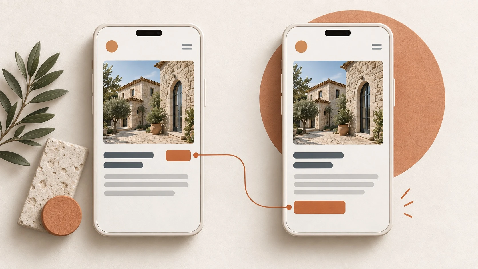
Another small change came when I checked the portfolio on a phone. The button to view the project sat next to the title. When the title was too long, the button dropped to a new line and threw off the card’s proportions. I asked for it to be moved below the description. Now you see the image and read about the project first, and only then get to the button.
Each of these changes is small on its own. Together they made the site clearer and more pleasant to use, which is why I took the time to get them right.
And what do you do with all the content from the old site?
The old site already had articles, projects, and pages worth keeping. I moved them to the new site and kept their URLs, so existing links still lead to the right place. I also wanted to reduce the risk of hurting the site’s presence on Google and in AI search tools.
I went through the images and plugins too. I reduced the image file sizes, checked what was still in use, and removed what wasn’t needed, after a backup. I wanted the new site to be tidy behind the scenes as well.
As part of the work, I checked that the page titles and descriptions meant for Google stayed the same as on the old site. We compared them across 92 content pages, and after launch we checked 103 URLs across the site.
Alongside those checks, I opened the site on my own iPhone and went through it myself. I wanted to see how it feels on a real phone: reading, scrolling, tapping, and making sure it’s comfortable to use.
Then it was time to go live
After all the rounds of design and fixes, I saved backups and moved the new site to the studio’s main domain.
Even after the site went live, I kept testing. I opened it while logged out of the dashboard, went through the pages, and tested the menus and the form. I also tested the accessibility tool and fixed issues that came up in how it worked with the animations and with keyboard navigation.
One of the tests was simply to send a message through the site. The thank-you page opened and the email landed in my inbox. It was a small moment that summed up a lot of work: the site is live, it looks the way I wanted, and people can reach me through it.
So, welcome to the new site
I’m glad I gave my own site the attention I give my clients’ sites. It does a better job of showing my work as it is today, it’s easier for me to manage, and it has room for the next projects and articles.
Feel free to look around, take a peek at the portfolio, and see what’s new.
And if your website has fallen a little behind too, or your business has grown and still doesn’t have one, I’d be glad to talk. We’ll figure out what you need and build a site together that fits your business today, with room for what comes next.
Let’s do it together.
Frequently asked questions
Why did I rebuild the website?
I built the previous site when the studio was just starting out. I've learned a lot since then, the studio has grown, and the site had gotten clunky. I wanted to get things in order, refresh the design, and make it easier for myself to add and update content down the road.
How did AI tools fit into the work?
I worked with Claude Design on the design and with Codex on the research, the copy, the code, the fixes, and the testing. I set the direction, reviewed the results, and gave feedback. There were plenty of attempts and fixes along the way.
What did I do with the content from the old site?
I kept the important content and the page URLs. I also checked that the page titles and descriptions meant for Google stayed the same as before. Images and plugins that weren't needed were reviewed before I removed them, and I kept backups.
How is the new site updated?
Through the WordPress dashboard, with fields tailored to the content using ACF. Text and images can be changed in the places set up for them, and the design stays intact. For this site I chose a custom-coded theme, without Elementor.
Does every old website need to be rebuilt?
Not necessarily. Sometimes updating the content, improving the mobile experience, or changing the design is enough. If the site is hard to edit, hard to add to, or no longer explains what the business does today, it's worth reviewing it to see whether you can improve what's there or whether it's better to start over.